Plant the seed. Grow your dreams.
What is Moneytree?
Moneytree is an app that provides users of all ages and backgrounds a way to securely transfer money, make online payments, and plan for the future with or without access to traditional banking.
With the emergence of COVID-19 in our society, many businesses have become resistant to using cash for payment. At the same time, not all people want to use credit cards or a traditional banking systems, which many e-wallet apps are linked to.
WHY SHOULD WE CARE?
“An estimated 4.5 percent of U.S. households (approximately 5.9 million) were “unbanked” in 2021, meaning that no one in the household had a checking or savings account at a bank or credit union” - FDIC National Survey
As a designer who takes pride in ensuring that inclusivity is part of the design process, I couldn’t help but think about that 4.5%. This is more than just some number; these are real people that other apps on the market need to remember when making their products.
So, I saw an opportunity in creating an app like Moneytree, where users didn’t need access to a bank account in order to sign up. Further, it inspired me to think about other underrepresented populations.
The Inspiration for innovation
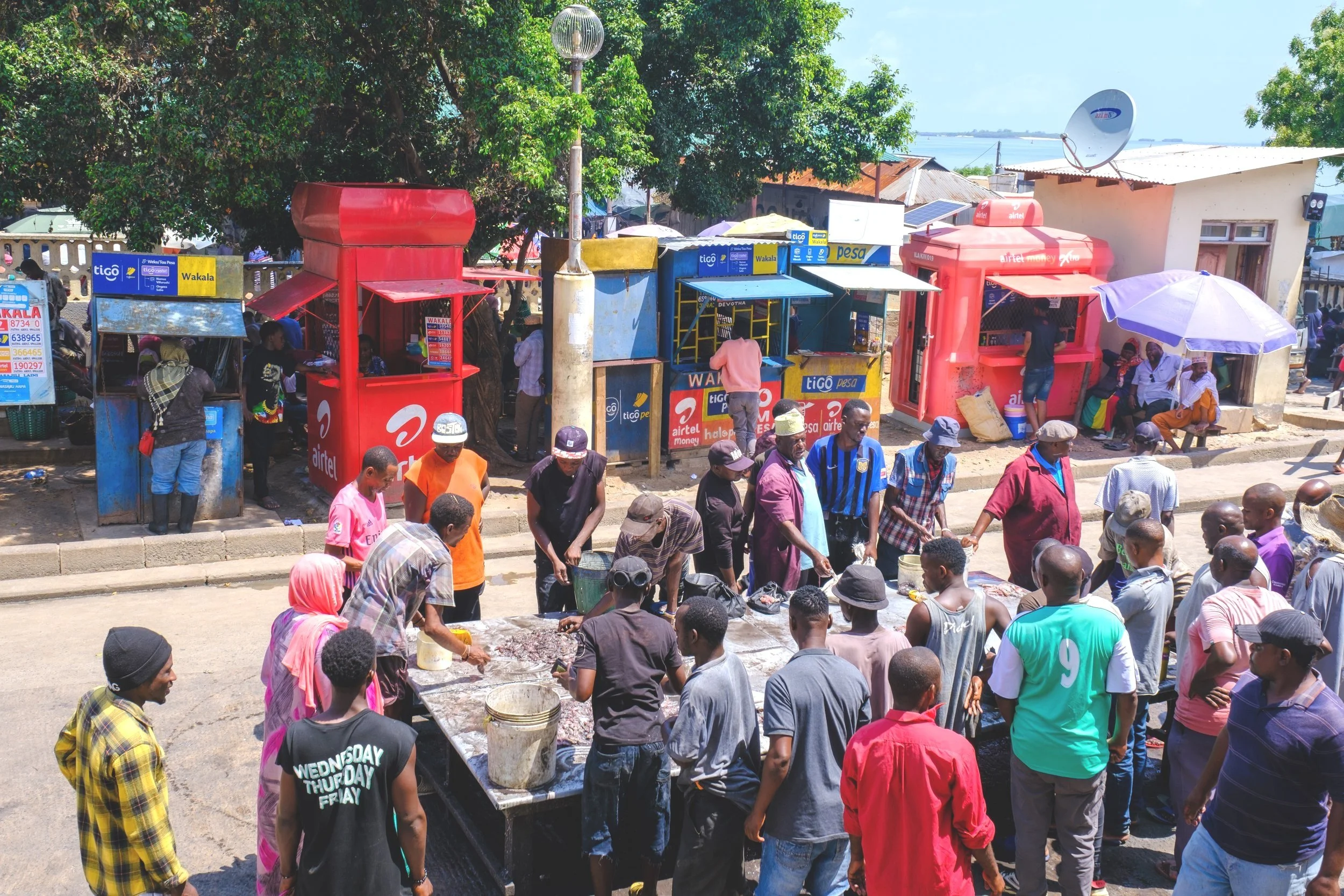
I was inspired by this approach after traveling in Africa and noticing that the entire country was essentially functioning using a cashless system and digital wallets. Those e-wallets were connected to mobile phone carriers and users could load their account with physical cash at participating vendors. Check it out!
Further, I was inspired to create an e-wallet application that enabled older adults and multilingual users to feel comfortable exploring finances on their phone in a way that was easy to learn and simple to manage.
I then turned my inspiration into overarching research QUESTIONS I wanted to discover
How can I make the app accessible for older generations who struggle keeping up with advancements in technology?
How do I establish inclusivity for non-English speakers living in the U.S.?
How can users without a bank utilize Moneytree and add money to their accounts?
time to craft my problem statement
People of all ages and linguistic backgrounds need a secure and approachable financial application so they can transfer money and save for their future goals regardless of geographic location or access to traditional banking systems.
Competitive Analysis
Starting in November 2022, I conducted an extensive competitive analysis that focused on two widely used financial apps: Venmo and Cash App. I did this to understand where these apps were successful in targeting their user market and where their weaknesses might present an opportunity for Moneytree.
Venmo
Free of charge for peer-to-peer money transfers and payments.
Predominantly used by millennials and small businesses.
Users view a live feed of current transactions.
Cash ApP
Allows its users to securely send and receive money
Incorporates user buy-in through strategic marketing strategies.
UX ANALYSIS Takeaways from top competitor- Venmo
The credit card feature in Venmo isn’t the most popular amongst its users.
Venmo does not offer cash back on purchases or rewards.
There is no recurring payment option yet in Venmo.
Venmo has a user feed feature to keep its users engaged. Do users actually like this feature?
I used these insights to develop solid research questions while targeting opportunities for Moneytree’s design.
Business Requirement Document
I crafted a Business Requirements Document (BRD) to outline the essential features of Moneytree and establish a specific timeline for development to stay on track.
While I had an original and broad target audience in mind, I started to narrow it down to older users (40+) with little to no experience with financial apps and were apprehensive to use it. This also helped structure my questionnaires.
However, I still wanted to make sure Moneytree included features that would be accessible to users who did not speak English as a first language or have access to a traditional banking system.
User surveys and Research Questions
I wanted to start focussing on quantitative data from users by generating closed questions in the form of a survey. This was a great start to working with a broader set of data that could easily be visualized. Utilizing my network and community, I was able to conduct 30+ surveys using Google forms.
From those responses, I was then able to start thinking about gathering more qualitative data to understand more about user’s actions and behaviors. During this phase, I was able to set up 6 different moderated virtual and in person interviews to analyze.
Example Research Questions
What digital wallet or banking applications do people currently use to manage finances, send and receive money, and use for purchasing of goods and services in person and online?
What are user attitudes around security and privacy when using e-financial solutions?
What features within current e-wallet or banking applications do users find the most engaging or easy to use?
What are some pain points with other e-wallet apps currently on the market that interviewees have experience with?
What type of financial literacy do potential users have?
Findings and Insights
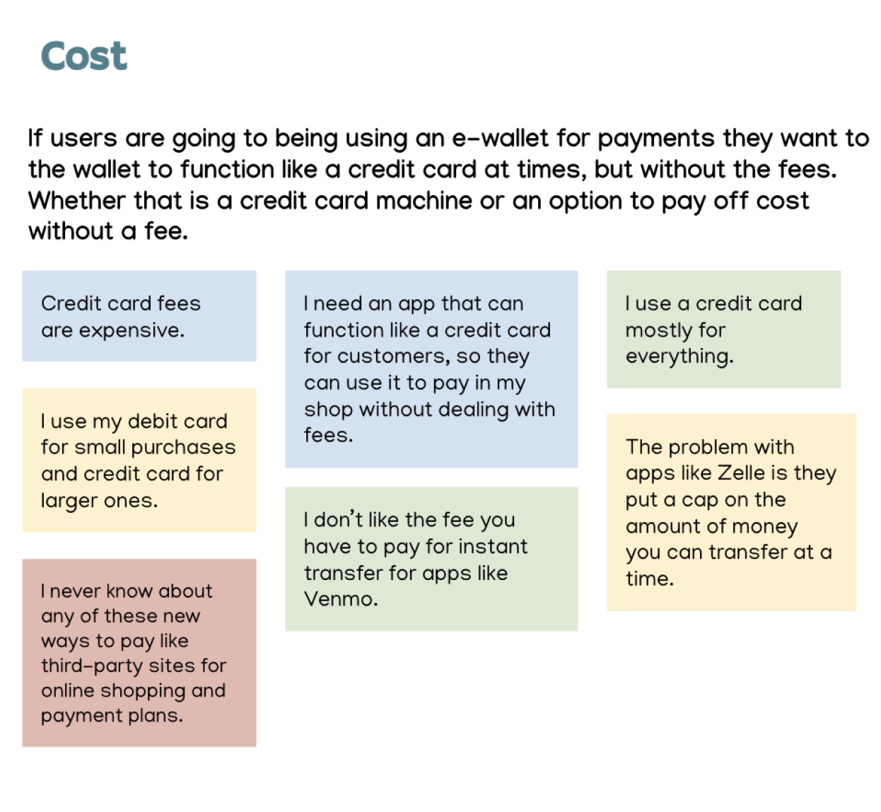
After completing user interviews I was able to dive deeper into survey findings. By composing thoughtful and strategic questions to interviewees, I was able to uncover more about app functionality, design preferences, enjoyable features, and more. Below is an affinity map summarizing key interview insights and takeaways.
Key Insights from Research Questions
Many people don’t understand a lot about what makes an app secure or the privacy features to look for.
Developing a good tutorial during onboarding could be an opportunity to set the app apart as well as using facial ID or texting codes
Most people are using Venmo and Paypal for P2P payments and enjoy it the most.
For online and in-store shipping, most people are using their credit cards for larger purchases and debit cards for smaller purchases.
Users don’t seem to care about social feeds in apps like Venmo where other people can see their purchases and vice versa.
Potential users, particularly older ones, want rewards for purchases.
These types of users might also be more inclined to use the app if they received points that could applied to future purchases at partnering retailers. Also, for cash back at the end of the year.
Avoiding Feature Creep
Following thorough surveys and interviews, various ideas emerged.
However, to ensure a focused and effective approach, I made the strategic decision to prioritize simple yet impactful features for the initial design.
Based off my findings and research, I decided to include the following features:
Sending/receiving payments, onetime and recurring.
Saving for future goals
Earning cash-back on purchases
I narrowed down my focus for two reasons:
To avoid feature creep
Remain true to my target audience of users with minimal technology and English language proficiency
User Stories
I decided to develop user stories from a few key voices from my surveys and interviews. This was to make sure I was always keeping the users’ needs in focus and hone in on my own empathy skills to put myself in their shoes. As a designer, I am the voice of the user user during project development and it was important for me to surround myself with as much of their reality as possible to translate this “user voice” into user stories so that all stakeholders can have them in mind throughout the process.
“As a user, I want to send and receive money to my friends, family, businesses, so I don’t have to go through the hassle of writing checks, using cash, or deal with credit card machines.”
“As a user, I want to create personal financial goals, so I can save for the things I want in my future.”
“As a new user, I want to easily understand all the features in an app, so I can begin taking charge of my finances right away.”
Developing User Personas
While user stories are helpful, creating a user persona was also an important part of my process because I wanted to represent a major user group for my app. By developing a detailed persona, I could make sure the major needs and expectations of my target audience were being met. Further, the personas provide a clear picture of user expectations and how people would most likely interact with the app.
An example of a main persona created:
By understanding Becky’s goals and needs, her motivations, and her frustrations, I was able to determine the features that I needed to include in my first design iteration. Specifically around financial planning and recurring payments.
User Journey
The next step was to take deeper look into the Becky’s journey while navigating a very specific task, which was to create a small savings account for her children by setting up recurring payments.
The purpose of creating a user journey:
Identify and understand Becky’s pain points and feelings while navigating a specific task and how those feelings might change throughout each phase.
To find opportunities in the gaps of the user’s experience and design from a place of problem-solving to alleviate any paint points before they would even occur.
User Flows
To prep myself for wireframing and protyping, I wanted make sure I some detailed user flows as a visual reference for business objectives and key stakeholders to understand the process steps when a user arrives at a specific entry point to complete their tasks.
Things I considered designing user flows:
What prompts users to begin the task?
What will tell the user their task is finished?
What information does the user already know about the process?
What information do they need to know to complete the task?
What tools will the persona need to accomplish their task?
Building a Site Map
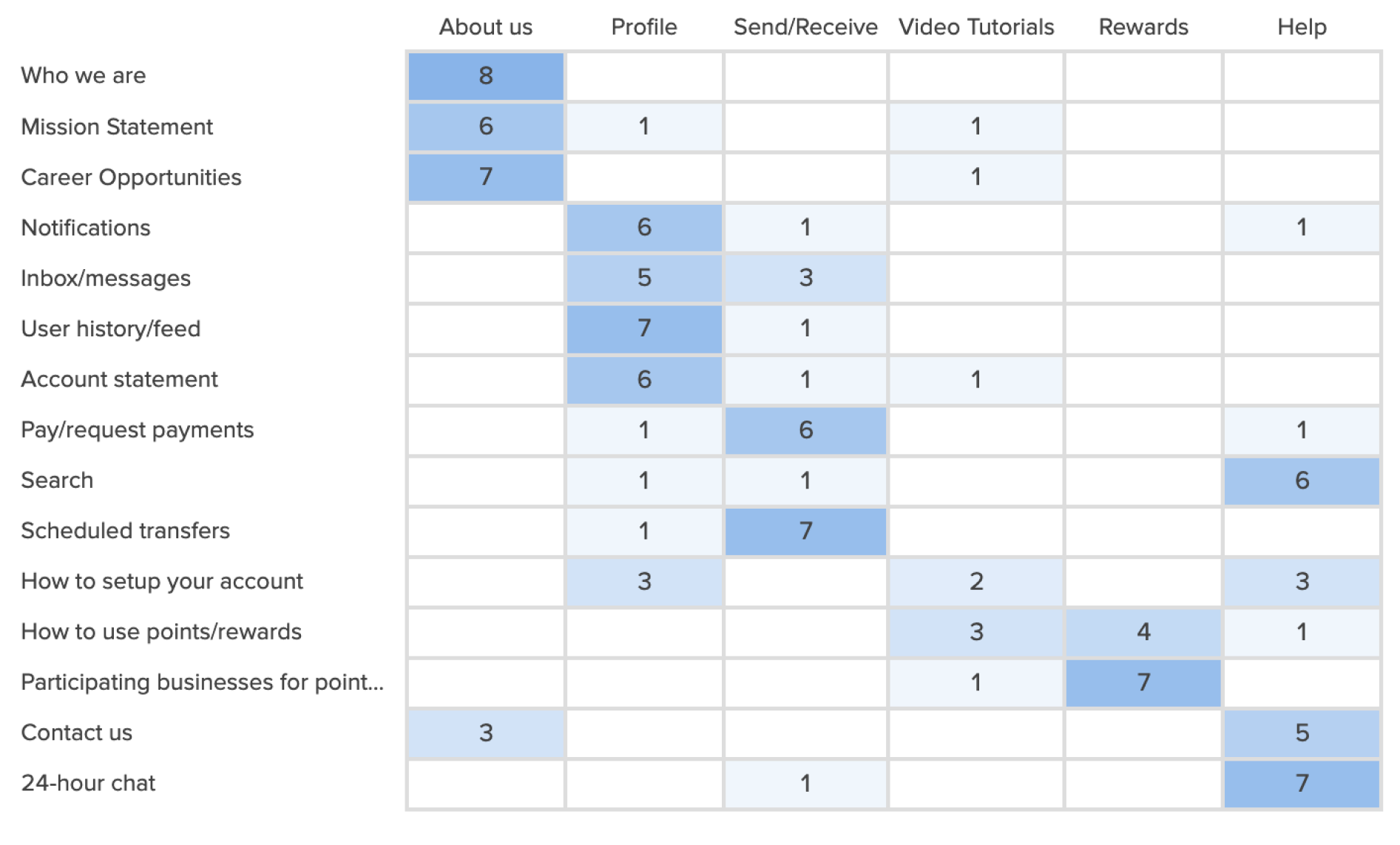
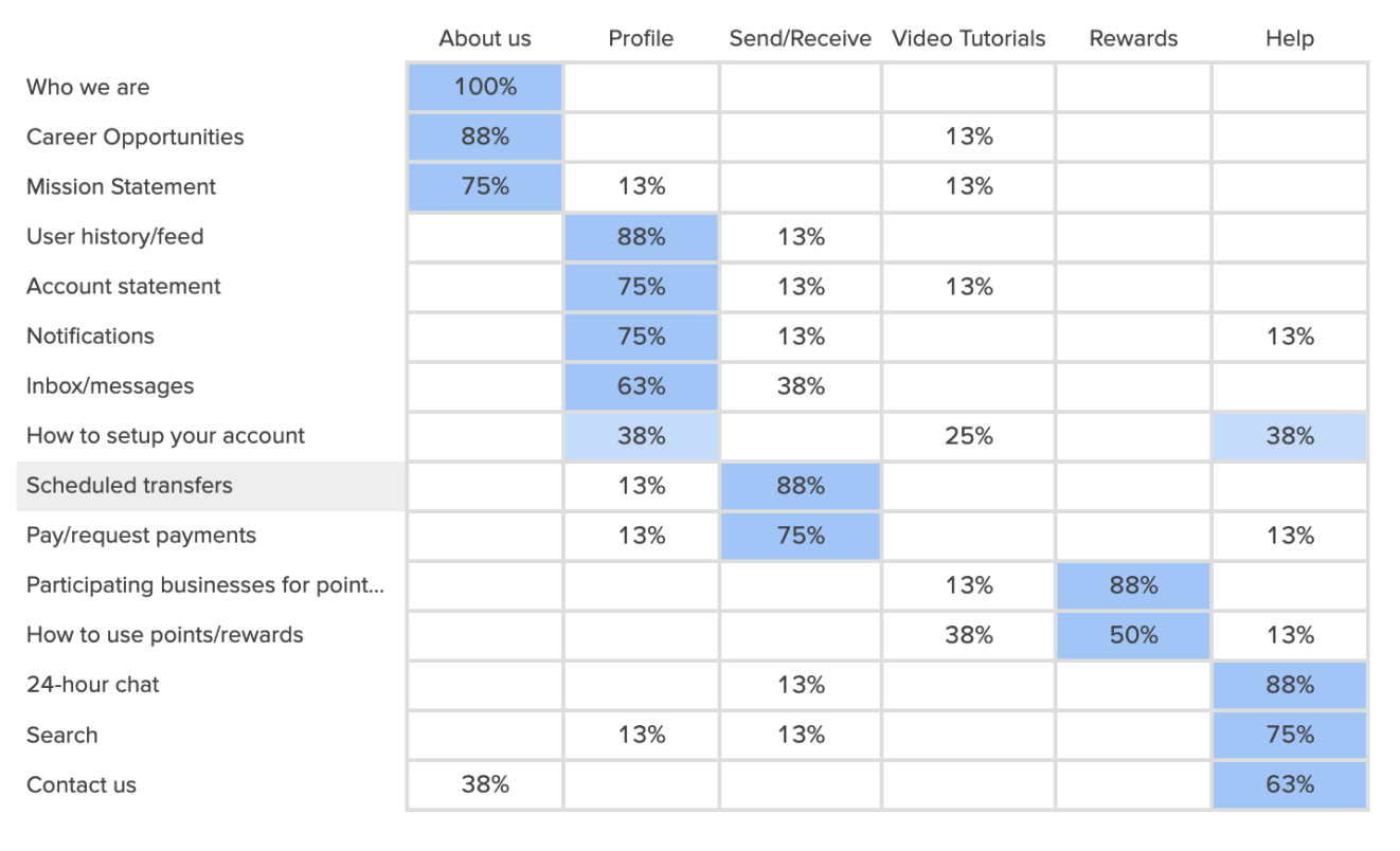
I designed a closed card sort activity to refine my original site map by asking participants to categorize cards based on their intuitive understanding, thereby reinforcing the organization of the information.
Results Matrix
Popular Placements Matrix
Card sorting was conducted virtually using OptimalSort. All of the participants were given explicit instructions and the card sort was completed individually.
Revised Site-Map
I omitted some prior categories after rethinking about my target audience because I wanted to make sure the design was still simple and easy to learn. Also, I did not want to overwhelm users with too many screens and places to navigate through.
Wireframes & Prototyping
It was now time to begin designing wireframes for Moneytree! I started with simple drawings to get all of my ideas out first before designing more mid-high fidelity wireframes with Figma. I focussed on onboarding and three specific tasks that were identified during my research as being the most common motivation for users to download an app like Moneytree.
Low-fidelity wireframes
Onboarding
ONBOARDING: I wanted to create an onboarding process that felt intuitive and would not overwhelm the user. I collected some feedback from my Spanish speaking friends who said having one task per screen with a decent amount of whitespace felt the easiest to take in. I also wanted onboarding to link directly to bank accounts or cards and for contacts to also be transferred easliy.
Task 1: Set-Up New Recurring Payment
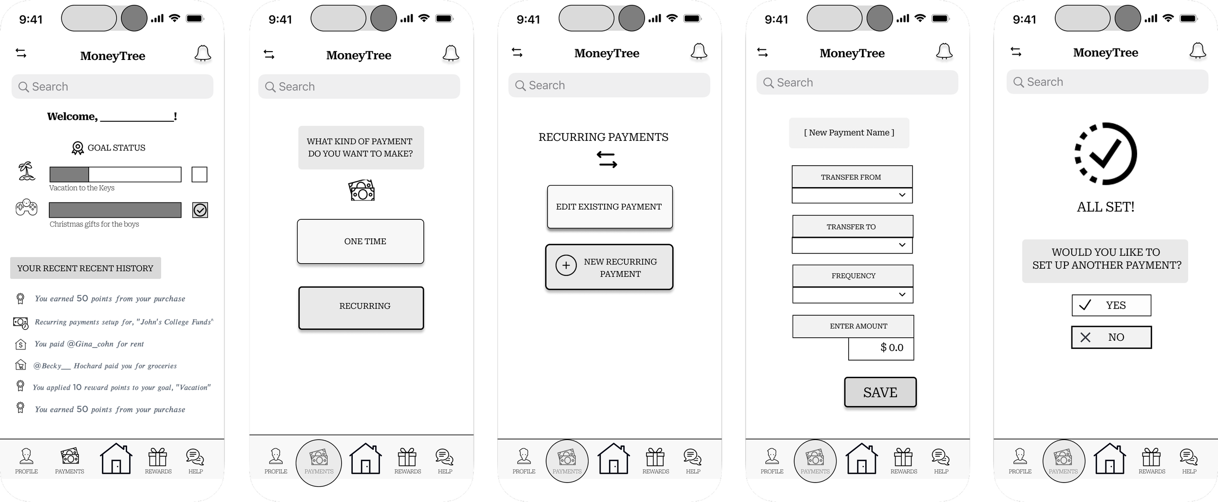
TASK 1# When users download the app their dashboard will display most recent activities and users can view their own feed only, which was an important insight from interviews. From the dashboard users can tap the nav bar at the bottom and be prompted into which type of payment they want to make, recurring or one-time. From there, the user can navigate through each screen to enter that payment information and then finalize with a confirmation page.
Task 2: Create A New Goal
TASK 2# It was important to create a feature that potential users were interested in and also something that set Moneytree apart from its competitors. Creating goals to save for by using cash back or rewards on purchases to fuel those goals was something I wanted to include.
Task 3: Set-Up One-Time Payment
TASK 3# One-time payment would follow the same flow essentially as recurring payments. The reason both tasks have the same flow is to ensure learnability throughout the application as some of the users might be working with financial apps for the first time or have basic tech literacy.
Mid-fidelity Prototypes
Once the MVP was finalized with initial sketches, I started to bring the wireframes to life with some simple language, icons, and CTA buttons. I also established a working nav bar at the bottom and was ready to begin prototyping my designs and conducting usability testing.
Usability Testing
Once my mid-fidelity prototypes were made, I was ready to test my prototype using Figma and recruit participants test it out. I tried to stay true to the user personas I originally made to create a more authentic simulation of this study. Through a combination of in-person and remote moderated testing, I got an idea of where the pain points were within the app and ideas about how to resolve it. There were only a handful of issues that came up, with only one being a high-priority.
Results
After synthesizing the issues from this first round of user testing, it was time for a new iteration. I felt like I had a solid understanding of user needs, interactions, and overall flow of my app. I was ready to begin high-fidelity prototypes.
Want to see more? Check out these links below
High-Fidelity Prototype
Moneytree went through several iterations after gathering peer reviews, applying grids, and adhering to accessibility requirements. I also included a language selection during the onboarding process to accommodate diverse language groups. Although the app has come a long way, there is always room to make it better. I settled on a basic color palette for this project that was WCAG compliant and some simple animations to give it life! I also included a way for users who do not have a traditional banks to “top off” their balances with cash at participating businesses. Here are a few snapshots from the latest design!
Lessons & Outcomes
After the latest prototype was created, I realized:
The design process is never really over.
I truly care about accessibility inclusion when creating apps.
I not only want to develop and design for users within the United States, but how to engage with users on a global level.
Some future ideas include:
Currency exchange within the app to allows users to continue using the app for payment regardless of where they are.
Financial literacy education incorporated into the design,


